Claude Design for marketers is best for speed and direction: wireframes, pitch decks, landing pages and mobile MVPs. To avoid generic output, load brand context first, including screenshots or a Figma file, voice rules, exact hex codes and a specific reference. Then ask for three directions and build a reusable system.
Marketers get the most from Claude Design on wireframes, landing pages, pitch decks and mobile MVPs, provided they load brand context before the first prompt and ask for several directions. It is a tool for speed and direction, so expect to hand off the final polish. Video ads, realistic product imagery, 3D and legally sensitive work should go elsewhere or get extra human review.
Product features and limits change quickly in this category, so treat what follows as a working method. Check the specifics against the current version of the tool.
The real shift is who gets to show the idea
For years, the marketer's job ended at the brief. You wrote the document, handed it over, waited, and watched someone else present it. The conversion thinking and strategy were yours, but putting them on screen was not.
A tool like this closes that gap, and that is its main value to someone in SEO, PPC, CRO or content. You can bring a finished-looking landing page or deck into the conversation, where you would previously have brought a wireframe and a request for patience. That changes how quickly a decision gets made. It does not make you a designer, and it does not remove the need for one on work that matters.
Why the first ten minutes decide the result
Generic output nearly always traces back to skipped context. Before asking for anything creative, I load four things:
- A Figma file, or a few screenshots of your homepage, a product page, a blog post and the footer.
- Voice rules, including forbidden words, tone, and example sentences from your best content.
- One specific reference site. A description like 'modern and clean' gets you the average, while naming a site and saying how yours should differ gives it something to aim at.
- Exact hex codes, your type pairing, the logo and your spacing rules.
Off-brand colours usually mean tokens were never loaded as hex values, and voice that slips usually means the forbidden words were never spelled out. Both are context problems, not model problems. Give it real pricing and conversion figures too, because it will fabricate numbers if you do not.
The habits that improve the output
Ask for three directions every time
Never commit to the first draft. I ask for one safe option, one bold one and one unconventional one. The safe one is often predictable, and the wild one often overreaches, but seeing all three shows you what is possible. If all three look identical, your prompt was too narrow, so name the differences you want.
Build the system once
The compounding step is a Design System Project holding your colour tokens, type, logo rules, spacing scale, radius and shadow rules, and voice guardrails. Test it by asking for something simple such as a button, confirm that it is on brand, then use it as the parent of future work. After that, you stop re-explaining your brand on every asset.
Refine, do not restart
When you want a small change, use the drawing tool: circle the area and describe the fix in one sentence. Re-prompting from scratch risks losing what was already working. And let renders finish, since interrupting them is a common reason they break.
One asset per session
Pick one real thing you need, such as next week's PPC landing page or Friday's pitch deck, and finish it. Running parallel sessions tends to break context. If you do run them, the rebuilt desktop app keeps them apart with nested sessions; see what Claude 2.0 is. A real deadline also gives you an honest test of whether the output is useful.
If you want this set up across a team, including the brand system and workflows, that is part of my Claude consulting.
What to ship and what to skip
I tested six use cases, and they did not all hold up.
- Ready to use: wireframes, pitch decks, landing pages and mobile MVPs. For decks, ask explicitly for speaker notes. For mobile, specify mobile-first at 375px width.
- Use with care: design systems, which I would only attempt with an existing Figma kit to upload.
- Skip for now: animated video. The output tends to look like animated web pages, not commercials. Use a dedicated tool such as Runway or Luma. These tools move fast, so retest this now and then.
A few more jobs also belong elsewhere. Hyper-realistic product imagery suits a dedicated image tool, and 3D needs a 3D-native one.
Plan for the last mile
Expect the first run to get most of the way, then plan for polish. Treat the export as a strong draft for a developer or designer to finish, not as the final file, unless the asset is simple and low risk. Use the Export button on the artifact instead of copying from the chat when you need code.
Two types of work deserve extra care. Anything in a regulated field, such as healthcare or finance, needs human review on every asset. And any performance claim, price or statistic on the page must be checked against a real source, for the fabrication reason above. Speed makes it easy to publish a confident mistake.
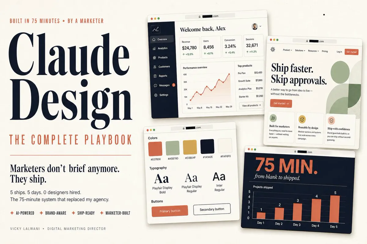
To start, block 75 minutes and spend the first ten only on context, even if it feels slow. That one habit makes the biggest difference to the quality of what comes back. The playbook breaks the session into timed phases and includes the starter prompts for six marketer workflows, plus fixes for the common problems.
This article expands on my post on LinkedIn ↗.
FAQ
What is Claude Design best for in marketing?
In my testing, it suits wireframes, pitch decks, landing pages and mobile MVPs. Design systems are worth doing mainly if you have an existing Figma kit to upload.
Why does Claude Design output look generic?
Usually because brand context was not loaded first. Give it screenshots or a Figma file, voice rules, exact hex codes and a specific reference before your first creative prompt.
Can Claude Design replace a designer?
No. It gives you speed and direction, but pixel-perfect production still benefits from a designer or developer. Regulated industries such as healthcare and finance need human review on every asset.
What should I not use Claude Design for?
I would use dedicated tools for video ads, hyper-realistic product imagery and 3D work. Claude Design's animated output tends to look like animated web pages instead of commercials.